Autor "Ian Wild"
Se han encontrado 1 Coincidencias
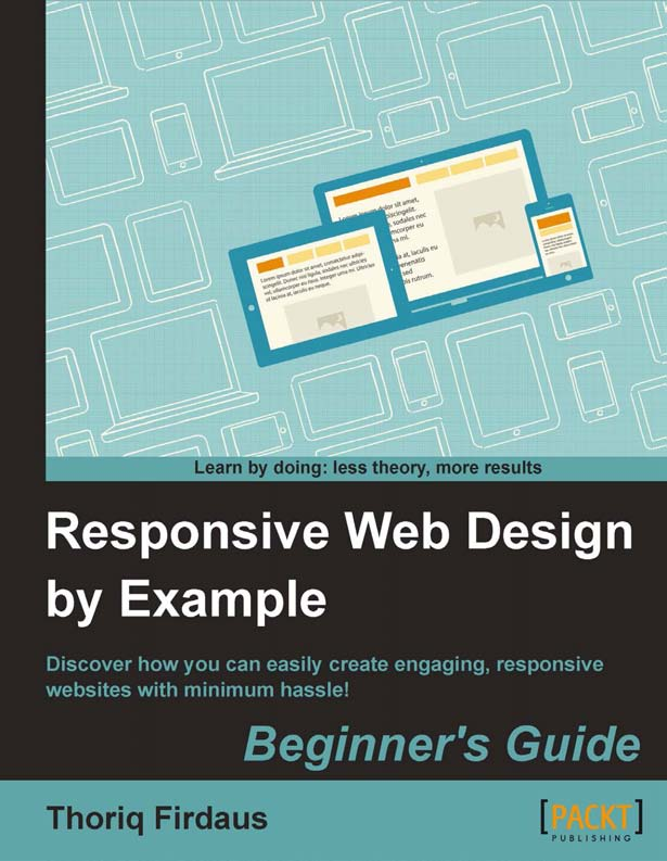
Responsive Web Design by Example
210 Visitas | 367 Descargas | 2013-09-23 17:07:03 | cbustillo
Discover how you can easily create engaging, responsive websites with minimum hassle! This event surely comes with a consequence on the other side. Designers are forced to think of new ways to deliver web pages for mobile users; we can definitely no longer rely on the static grid, since the sizes of mobile devices are too varied. In 2010, Ethan Marcotte [http://ethanmarcotte.com/] coined a new answer to this situation called responsive web design [RWD] that now has become a popular practice in web design to deliver web pages in varying viewport sizes [http://www.alistapart.com/articles/responsive-web-design/].
Contribuir
Usted puede contribuir con Libros UCLV, es importante para nosotros su aporte..
Contribuir